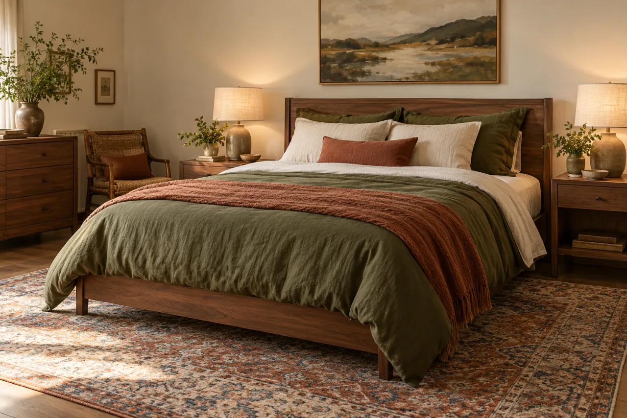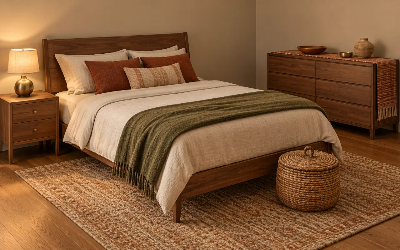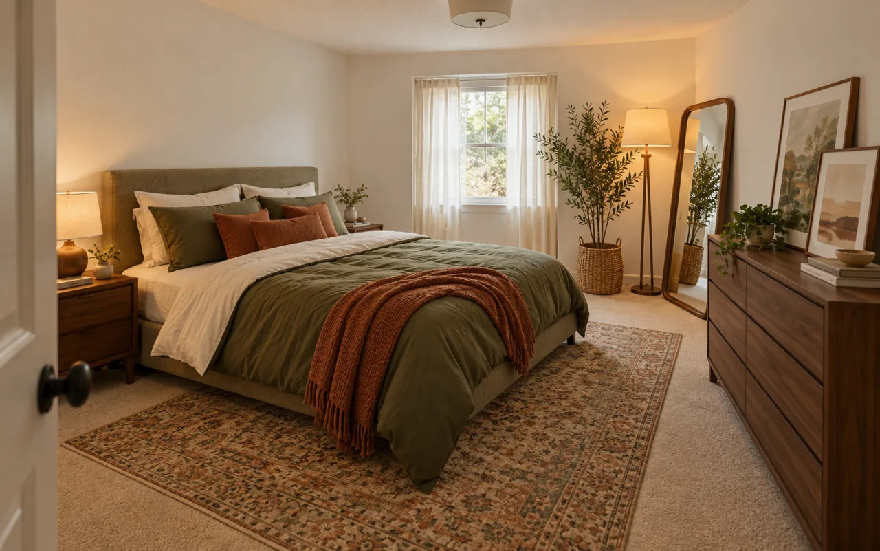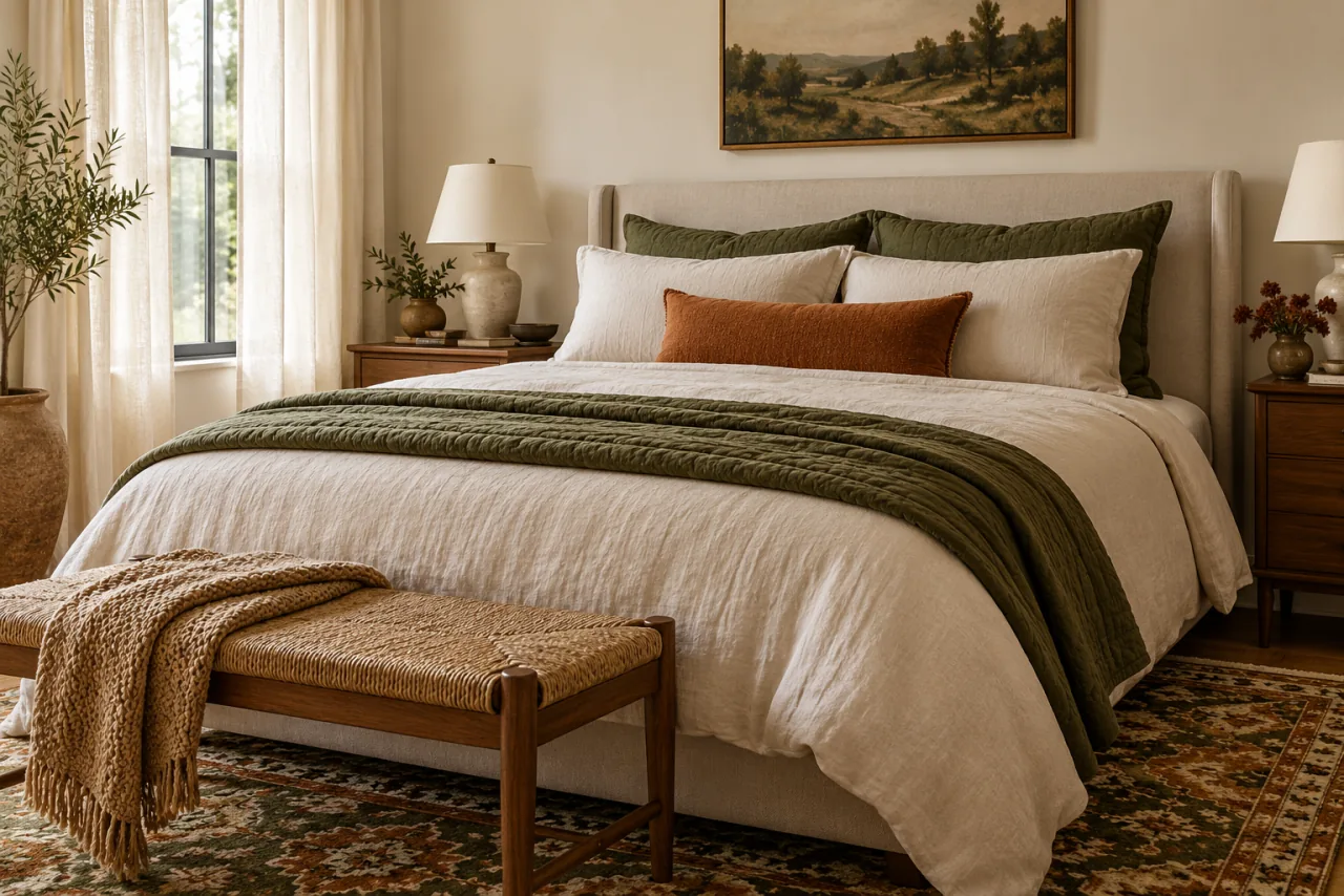
Olive and rust are a classic earthy pair, but they are also two strong, warm colors that can easily tip a bedroom into heavy or dated. What makes the combination calm is the base underneath it: warm cream, oatmeal and wood that give both colors room.
This is a color recipe rather than a shopping list. It covers how much of each color to use, how to tell olive from sage, how to match rust to olive so neither shouts, and how to account for walls and furniture you are not changing. The last ideas show how to test everything with fabric before you open a can of paint. Most of the tests use items already in your home, so you can settle the palette before spending anything.
1. Set the Proportions Before Choosing Pieces
A simple ratio keeps the palette balanced: roughly 60 percent warm neutral, 30 percent olive and 10 percent rust, counting everything you see from the doorway. The neutral share includes walls, sheets, a rug field and curtains; olive covers one or two large textiles; rust is a handful of small accents.
Starting with a ratio stops you from buying a rust duvet, then realizing nothing else can hold its own.
Try it without buying: Take a photo from the doorway and roughly shade each color area on it with a marker; see how far the room is from 60-30-10.
Watch out: The ratio is a starting point, not a rule. A very bright room can carry more olive; a small, dim one may need more neutral.
2. Read the Undertone of the Walls You Already Have
Walls are the largest surface in the room, so they decide how olive and rust read. Warm white, cream or beige walls make both look rich. Cool white or gray walls make olive look drab and rust look brighter by contrast. Pink-beige walls can make rust look pink.
Hold a piece of olive fabric and a piece of rust fabric against the wall by the window, then repeat at the wall opposite.
Try it without buying: Compare the wall with a cream dish towel and a bright white sheet of paper; whichever blends better tells you which way your wall leans.
Watch out: If your walls lean cool and you cannot repaint, push the bedding and rug warmer to compensate.
3. Rule Out Sage with a Paper-Bag Test
Olive and sage are both muted greens, but olive leans toward brown and yellow while sage leans toward gray and blue. The difference decides whether rust looks warm or harsh beside it.
Lay the green fabric next to a brown paper bag, then next to something mid-gray. Olive looks related to the bag; sage looks related to the gray. Choose olive for this palette.
Try it without buying: Run the test on every green textile you own and keep only the ones that side with the paper bag.
Watch out: Screen colors are unreliable. Ask for fabric swatches or check return policies before buying large pieces online.
4. Match Olive's Depth to Your Room's Light
Olive ranges from light moss to deep army green. In a room with limited daylight, a deep olive on the bed can look nearly brown at night. In a bright room, a pale olive can wash out.
For most bedrooms, a mid-depth olive works for large pieces, with deeper olive saved for smaller items like a pillow or a chair cushion.
Try it without buying: Place your olive item where the bed is and look at it at dusk with only lamps on.
Watch out: Two olives that differ only slightly in depth look like a mistake; use clearly different depths or just one.
5. Pick a Rust from the Same Depth as Your Olive
Olive and rust look like a family when they share a similar darkness. A quick check: take a black-and-white photo of the two fabrics side by side. If they turn into nearly the same gray, they balance. If the rust is much lighter, it will look bright and orange; if much darker, it will read as brown.
Rust ranges from soft terracotta to brick and cinnamon, so there is usually a shade that matches.
Try it without buying: Gather everything you own in rust tones and run the black-and-white photo test against your olive.
Watch out: Pumpkin and bright orange rarely pass this test with olive; they read as seasonal decor.
6. Keep Rust Restrained with Texture and Mixed Threads
Restrained rust does not mean pale rust. It means smaller areas and softer surfaces. A rust knit, velvet or slubby linen reads deeper and quieter than flat, smooth cotton in the same color, because the texture adds shadow.
Woven pieces that mix rust with cream threads, such as a striped blanket or a kilim-style pillow, dilute it further while keeping it visible.
Try it without buying: Compare a smooth rust item and a textured one side by side from the doorway.
Watch out: Many small rust items scattered around the room add up; count them toward your 10 percent.
7. Find a Cream That Leans Warm
Cream is the buffer that keeps olive and rust from crowding each other. Ivory, cream and light oatmeal all work; bright white looks stark and makes both colors look darker and heavier. A good cream looks slightly yellow or slightly beige next to bright white.
Stick to one cream family, either more yellow or more beige, so the base looks consistent.
Try it without buying: Lay your sheets, pillowcases and a cream throw side by side under lamp light and remove the one that looks pink or gray.
Watch out: Very yellow creams can turn sallow in warm evening light; mid creams are safer.
8. Build the Bed on a Warm Neutral Base
A warm neutral bedding base means the largest piece on the bed, the duvet or coverlet, is cream or oatmeal, and the colors sit on top: olive on the shams and a quilt folded at the foot, rust on one lumbar pillow or a throw.
This version suits small or dim rooms, because the brightest surface stays brightest. In large, bright rooms, an olive duvet with cream sheets works too, but the neutral-base version is easier to change seasonally.
Try it without buying: Flip a reversible duvet to its lighter side and move your olive and rust pieces on top.
Watch out: A cream duvet shows wear quickly; look for a washable cover and a darker oatmeal shade if you have pets.
9. Add a Bridge Shade Between Olive and Rust
Olive and rust can look like two separate ideas when nothing links them. A bridge shade, such as camel, ochre, tobacco or warm tan, sits between the two and makes them read as one family. It can be a leather-look tray, a camel throw, a brass-toned lamp or a mustard thread in a pillow.
One or two bridge pieces are enough; they count toward the neutral share.
Try it without buying: Look for camel or tan items in your closet, such as a scarf or a leather bag, and place one between your olive and rust pieces.
Watch out: Too much mustard turns the room yellow; keep it to a detail.
10. Pull the Palette from One Patterned Piece
A pattern that already contains olive, rust and cream takes the guesswork out of matching. A rug, a pillow, a quilt or a print with all three becomes the reference, and solids are chosen to match it.
Carry the pattern piece when you compare fabrics, or photograph it in daylight.
Try it without buying: Look through your home for any pattern that contains at least two of the three colors and test it in the bedroom.
Watch out: A second large pattern in the same colors competes with the first; keep the other pieces solid or textured.
11. Count Your Furniture in the Color Math
Furniture carries color too. Orange-toned wood such as walnut-look or cherry adds to the rust side, so you may need less rust in textiles. Black or dark-stained pieces add depth and pair well with olive. White furniture counts as neutral but can look stark; warm it with a cream textile nearby.
Account for this before adding textile colors.
Try it without buying: Squint at the room from the doorway; whatever color pops first is already doing work.
Watch out: Gray-washed or cool-toned wood fights with this palette; balance it with warmer textiles nearby.
12. Test with Textiles Before You Paint
Textiles before paint is the safest order. Fabric can be moved, returned or swapped; paint commits a whole wall. Live with olive and rust textiles for two weeks, through bright and cloudy days, before deciding whether walls need to change.
If you then want color on the walls, use large sample patches in several spots and check them morning and night. There is no universal "right" olive paint; it depends on your light.
Try it without buying: Drape an olive blanket over a chair against the wall where you would paint, and live with it for two weeks.
Watch out: Small paint chips look lighter than a full wall; large samples avoid surprises.
13. Shift the Balance with the Seasons
The same palette can feel cooler or warmer by changing the ratio. In colder months, add a rust throw and a deeper olive quilt. In warmer months, fold them away and let cream and a lighter olive take over.
Because the base stays neutral, only a couple of textiles change.
Try it without buying: Store the rust throw for a week and see how the room feels with mostly cream and olive.
Watch out: Swapping everything every season is tiring; keep changes to two or three pieces.
An Olive and Rust Bedroom Palette Checklist
- Aim for roughly 60 percent warm neutral, 30 percent olive, 10 percent rust.
- Check your wall undertone before choosing fabric shades.
- Rule out sage with the paper-bag test.
- Use mid-depth olive for large pieces and deeper olive for small ones.
- Match rust to olive's depth with a black-and-white photo.
- Use textured rust and mixed-thread weaves to keep rust restrained.
- Choose one warm cream family and avoid bright white.
- Put the bed on a cream or oatmeal base with olive and rust on top.
- Add one or two bridge shades like camel or ochre.
- Count wood furniture toward the rust share.
- Test with textiles for two weeks before painting.
Common Questions
Do olive and rust go together?
Yes, when they share a similar depth and sit on a warm neutral base. Problems usually come from bright orange, a gray sage or too little cream.
Should I paint my bedroom olive green?
Try textiles first. If the color still feels right after two weeks, test large paint samples on several walls and check them in morning and evening light.
What neutral goes best with olive and rust?
Warm cream, ivory or light oatmeal. Bright white and cool gray tend to make both colors look harsher.
How much rust is too much?
When rust shows up on more than three or four items or on a large surface like the duvet, it starts to dominate. Keep it to accents.